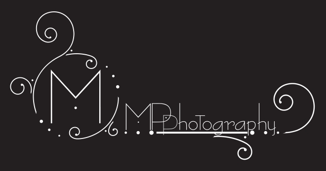
The last few days I’ve been working on getting a logo finished. I had a logo..sort of… and business cards and the whole marketing crap started, but it was a hastily put together affair and looked really basic. I decided it was time to refine the mess into something a bit more representative of myself and my brand.
I know just enough graphic design to get myself into trouble. I took 2 courses in college years ago that were literally trial by fire and I learned a lot. I’m not sure if it was just this particular instructor or it was the program, but the intro to graphic design class was brutal – they expected you to know how to use Illustrator from the start of the class. I didn’t. And – I was the only person in the class that wasn’t headed into a graphic design major!
I think the equivalent in photo terms for that first week of class goes something like this: expose 3 rolls of film, develop them, and print out eight 8×10 prints by next class – haven’t used a darkroom? Too bad, figure it out.
If you’ve ever used a graphic design program, you’ll know it’s all about the short cut commands. Without those you fumble around a lot and it takes forever to finish things. That’s assuming you know what you’re doing in the first place. I accomplish a lot by brute force and sheer effort, but I’m sure there’s a lot of easier ways to do what I try to do in the program. That’s the problem with learning things by yourself – you skip whole portions of the program and have massive gaps in your knowledge.

So. I got the logo thing where I want it. It’s the circular mess with the stand-alone M. The rest of it works into the business card that I’m still picking at. I had issues with legibility when I tried to import the logo into photoshop for a watermark, so I modified it a little to work. A watermark really serves two purposes – the first is to keep people from using your work. The second is to identify the photographer. The problem is that anything legible enough for identification is distracting and annoying in the photograph.
I should add that I’m not a graphic designer. Not a bit. However, since I can’t really afford to have an expert put the thing together I have to attempt it myself and hope that it doesn’t look too horrible. To a graphic designer I’m sure it does, but the general public may be fooled. The general public doesn’t need to know that I still don’t know the right way to join a path – well, now you do. It’s my hope that you don’t care.

